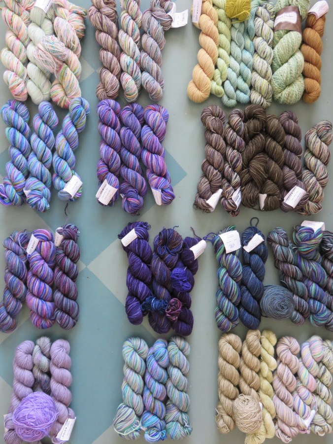
I won the July Make-It-Koigu! (Mine was the only entry.) Above are the skeins I laid out as I was figuring out the warp below. All but one handspun skein is Koigu.
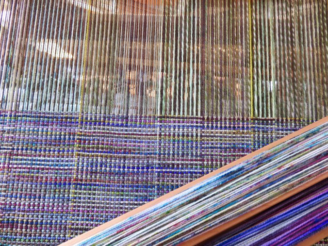
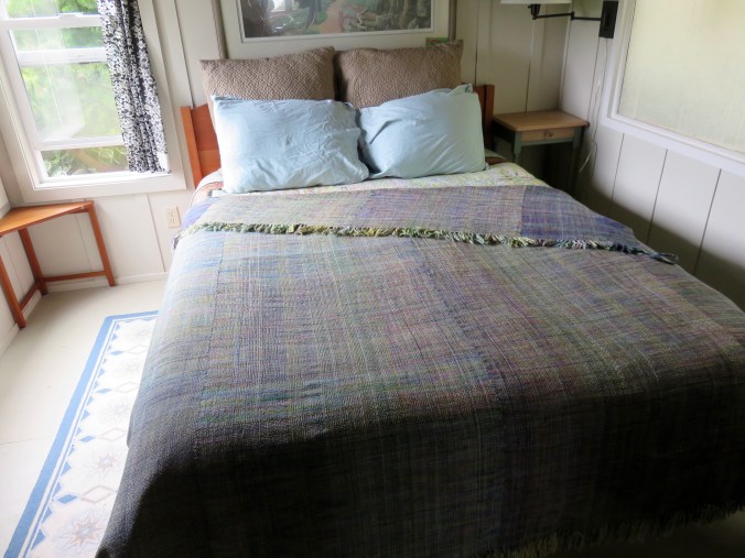
The final blanket was woven in four strips on two warps.
I won the July Make-It-Koigu! (Mine was the only entry.) Above are the skeins I laid out as I was figuring out the warp below. All but one handspun skein is Koigu.
The final blanket was woven in four strips on two warps.
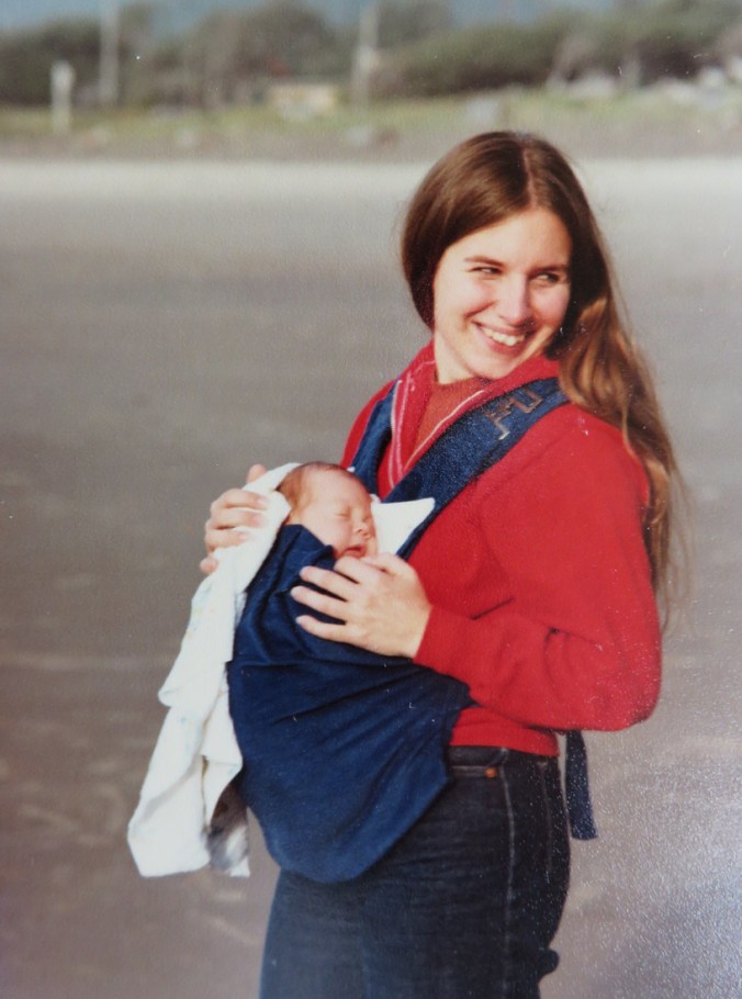
With baby Ian in 1982. Maybe not the 4th, but there are the colors.
When I was a little girl, I looked at a book with colored illustrations of flags. Compared to the emblems and gilded centers of others, I did not like the U.S. flag much. It was out of balance to my eyes, and the color scheme did not appeal to me. It was not so boring as all those European flags with only two or three horizontal color bands, but far less interesting that the ones with colorful emblems, or Japan’s elegant simplicity. I understood as I aged that the flag is symbolic, however, and that it represented notions of fairness and opportunity and liberty admired throughout the world.
Nevertheless, the reason I have never cut or damaged or worn the flag might signify less respect for our flag than artistic preference.
Still, a flag is a symbol and symbols matter.
A symbol is less important than what it symbolizes. It is less important than its people. It is less important than its ideals.
So I wonder sometimes, what people mean when they use the flag.
Men driving around with a flag hanging off the back of a vehicle seems less patriotic than disrespectful. The stars and stripes made into headgear likewise causes me to cringe.
I am loyal to my country, despite recent developments, despite the man in the Whitehouse, despite my discomfort with fellow citizens who get the news from shock radio and memes, do not read books, and perversely assume politics are beneath their notice. The 42%, give or take, who still support what this administration is doing to our global reputation.
Our reputation has already taken hits.
Who has the right to use the flag for their personal agenda? This is the Land of the Free, so anyone may. If some are offended by flag burning, let me say here that I am offended to see a United States flag wrapped around someone’s head or dragged behind their pick-up truck.
Some of my ancestors have been here a long time, the more recent arrived in the 20th century. My immediate family was born here, but distant and not-so distant relatives came from other nations including England and Mexico, Finland and Scotland. Those traveling north from south, west from east. The eldest moved east to west. Such is the passage of human migration, the claim of humanity on any land. The only claim I have on this soil is personal.
Just now the flag flying day and night in the yard of a house due south of me is hanging still. I do not display a flag, but I know that proper treatment of our national symbol includes taking it down unless it is lit in the dark. I know it is not proper to use this symbol of respect and righteousness as a bludgeon. I am sorry that my country is no longer a beacon light of hope in the world but become the bully on the block.
I will go out on my walk, and along the way I will greet other walkers, the roar of water constantly in motion, just as I must remain moving to be alive.
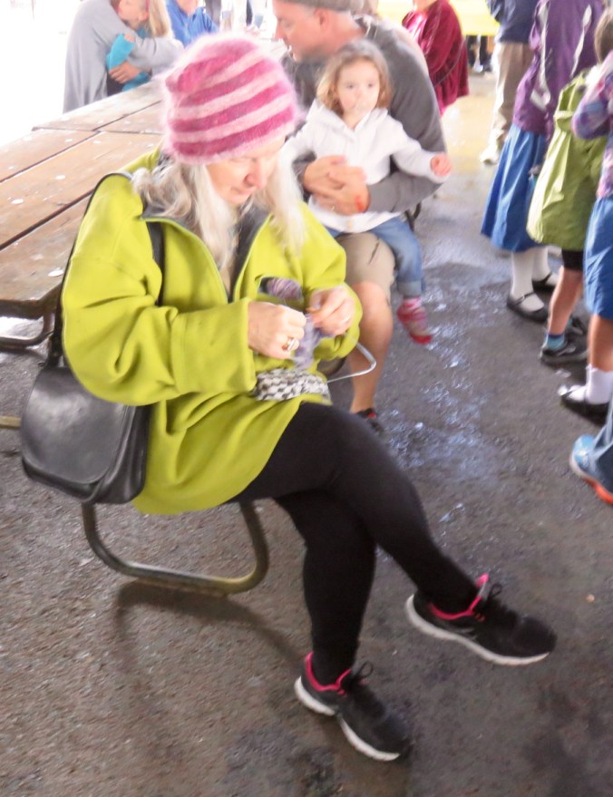
It was raining in Portland. Kids were dancing. The music was fine.
Today is a big day. Sand Castle Day happened in Cannon Beach and Rose Festival in Portland. It was also World Wide Knit in Public Day, so I took my knitting along with me to the Scandinavian Midsummer Festival in Oaks Park. We’d gone to the Scandinavian Festival closer to home, but this was our first time to the one in Oaks Park. The skies poured rain down on us and the traffic was terrible on the way over, but we found the venue without getting lost. I wore my pussy hat to keep my head warm and a huge sport top I borrowed from my son Alan almost 20 years ago and never returned.
It was a wet day, but I finished my swatch for . . . something. I have 7 skeins of a lovely tweedy-painted violet and blue Koigu merino 2-ply and a matching extra fine, silk-and-mohair lace-weight, which is also from Canada. I think I bought them to knit a sweater.
When I got home, the sun was shining, I blocked the gauge swatch, and now I suppose I will have to write up a pattern and actually knit a garment.
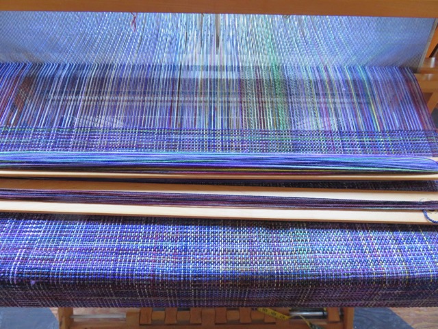
When I am not teaching and when I want a break from writing, or I am feeling wounded and drained (it happens), I weave. Sometimes I quilt.
I have a friend who sells a lot of work urging me to join a group, open an Easy account, or in some way make some money from my work.
It’s not going to happen. I give weaving to friends and charities. I make baby blankets for expectant parents. I give them to friends. New Mexico children’s illustrator and YA author Betsy James, Russian sculptor Marina Globova, and Oregon novelist Molly Gloss have my shawls/scarves. (See below.) I don’t have a photo, but professor of animal scientist Temple Grandin has one draped on the back of her couch in Colorado. My shawls live on shoulders in Alberta and Washington and California. Each one gifted.
I put on warps and choose weft colors specifically to suit what I understand about their preferences.


I make a quilt and knit a blanket for each grandchild at birth. I make another when they turn two. When they go to college, I will make them each another. I try to use their favorite colors, though children change their minds. A sweater begun in July may no longer appear by the time it’s finished in October.
In the mean time, I weave.
Tomorrow, I will begin my first warp of the year. I am thinking red and browns this time. There was a saffron warp a few years ago and I still haven’t found a home for two very special pieces. There was the “Peacock” warp and one for Ruby and seasonal warps where the weft varied to take me through Spring, Summer, Autumn, and Winter. Each warp yield two or three or even four pieces. I like color, but sometimes the more subtle combinations appeal. Each piece is meant to be distinct.
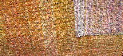
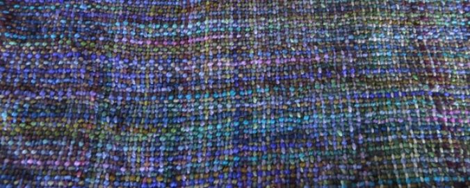
I will begin pulling skeins and winding tomorrow.

So yes, I know: buttercups and warm lights, the shadows on a polar bear and pollen. Lemon curd sauce and angel pie, the afternoon light glowing in the living room. Gold on my fingers, the tint of big leaf maples in September. Bananas, egg yolks, buttered corn. Caution signs, dandelions, honey bees.
Even so. The color is a problem for me. I delayed considering it here. My mother loved yellow because as a child with yellow hair she was told she should never wear the color. She wanted to wear yellow to spite that notion. But I have no memory of my mother in yellow.
Mom washed a white Orlon sweater and laid it out on a rack in the sunshine to dry and it turned yellow. “Ruined,” she said. Old bruises turned yellow. After a filling, I had a bruise sliding down the side of my face for weeks. Once the blood in that bruise was turning yellow, people kept asking if I had been hit or run into something.
My second baby was yellow with jaundice and I cried on drives back and forth to the hospital to feed him, blinders on his eyes, lying uncurled under billy-lights. Would;t he have been better off lying bare against my chest?
The pages in my books can be said to have yellowed, but the color is perhaps more orange than pure spectrum yellow. Yellow has some baggage in my life. Nothing dreadful, but a minor prejudice.
My grudge against yellow dates to Hazel Koenig’s design class my freshman year at the University of Washington. We were working with poster paints, creating color wheels of tints and shades. My yellow looked pure enough. When white paint was added, I created a gradient of pale and paler yellow tints. But when I added black, the shades of yellow were green. That’s because a super concentration of blue or green or even purple is used to produce paint that appears black. The flaw was not in the yellow pigment, but in the black. I wanted darker yellow and I found shades of olive and laden instead.
My grandmother painted her beach house yellow inside. The bedroom walls were two or three shades of intense blue with white carpet on the floor. Everything else was yellow—walls, carpet, appliances, even the Mixmaster in the kitchen. I think she was after a cheerful color, a sunny yellow on the cloudy coast. I have tried palest gray-pink and taupe and green and rose, in pursuit of the same effect. Now the walls are pale lavender and I avoid yellow.
Except, I do not avoid yellow. I use it, the complement of purple, in weaving and quilts. I am cautious and yet there is is again and again, those yellows and golden hues.

Left is an early version of the last quilt I pieced, “Rain,” the colors laid out and unstitched. I wanted mostly tints and shades of gray, but here I tried pinks, reds, and maroons played off against purple, a range of colors on a ground of mottled-gray. It did not work for me. I lifted them all, cut new strips. The whole project was laid out on our bedroom carpet for weeks while I was changing my mind about color.

Above is the layout I settled on after Gary and I had been stepping around the edges of carpet for over a week. After several shifts, I made my choice about color. Yellow sunshine raying from the upper right where you will find it in many children’s drawings of the sky. The sun in upper right smiling down on the green grass and hopeless perspective of a six year old artist learning to use poster paints and crayons.
We always draw the sun as a yellow disk, the moon as white. The gold of day and the silver of night, though even in the midnight blue sky, the moon too is gilded.

When I became licensed as a K-12 Art teacher in 1976, I knew it was unlikely that I would find a job teaching students younger than high school age. Those little kids I worked with in my field experiences would never be mine for more than a few hours during my one-week assignment. Most districts considered arts a “frill” and that cutting out construction paper hats would do as an introduction to the visual arts.
Even then, elementary programs rarely included arts specialists, though junior high and middle schools did. However, while completing my program at the University of Washington to become an Art teacher, I worked in the art programs of several school districts, including the Northshore School District which then employed arts specialists at all grade levels. It was also ranked as the finest public school system in the state. It was, and is, a wealthy school district, but a recent book by Sir Ken Robinson, PhD, and Lou Aronica reinforces my experience in 40+ years teaching in private and public schools, 25 of them as an English teacher. Increased focus on “the basics” and teaching to tests has done our children no favors.
It may seem counter-intuitive to insist that spending all day on math and reading (often out-of-a-box instruction) may actually make our children weaker in those subjects, but that has been my observation. The much-lauded Finnish school system seems to bear this out. Only a creative and richly diverse education will produce the citizens we want in our future.
Allow me to indulge in a when-I-was-young digression:
Most of my elementary education was in a public system north of Seattle. We had choral music and instrumental music specialists, physical education specialists, and individual teachers with particular skill in math and science as well as history and literature. I was introduced to musical instrument with an assigned recorder when I was eight years old. My parents would not allow me to study the oboe (I failed to practice my recorder and they were unconvinced I would last long enough on the clarinet to get to the oboe). Nevertheless, I continued taking Music Appreciation classes required of all students through Sixth Grade. That year I also took pre-Algebra, observed the life cycle and behaviors of meal worms, designed an experiment to determine if white cloud mountain fish could perceive color (maybe), and wrote reports citing a variety of sources from books and periodicals. I attended the second best school district in the State of Washington. While there was no art specialist at Echo Lake Elementary School, we’d begun learning to play musical instruments in 4th grade and later had Band, Music Appreciation, and so forth throughout.
Cordell Junior High (7th-9th grade) had, according to my yearbook, about 980 students. There were 43 teachers, 3 councilors, a vice-principal, and a principal. It had two full time art teachers. My seventh grade Algebra teacher was also the Jazz Band director. There were also full time choir and band teachers in this public school. Many of us went on to college.
By contrast, the small school system where I still teach college classes employs two music specialists (Choir and Band) who teach elective classes in grades five through twelve (over 800 students), and a single teacher who teaches art electives 4/5s time to grades nine through twelve (over 400 students). There is no art specialist teaching at the middle school. At the elementary level, there has not been an art specialist, so far as I know, ever. But there are still a music specialist and and P.E. teacher (one of each for 800 students) in our athletics-obsessed community.
The art and music and physical education specialists have been protected by an administration determined to hold onto “frills” that are necessary for so many of our students.
Money is the motivator we pray to. We focus on “basics” because we believe they will profit us more. Lost, in this dynamic, are thought, analysis, critical thinking, and creativity. There is almost nothing creative about read-the-passage-and-identify-the-following. There is almost nothing creative about addition or memorized times tables. Reading and arithmetic can be taught in creative ways, but rarely are. Creativity itself is a maligned and neglected step-child of our current educational system.
How will this profit us in the future? we ask. And “profit” is spelled only with dollar signs. Despite the idealism associated with youth, new high school students are told too often that doing well in school will earn them a higher income. Too often we fail to explain how education might make them wiser voters, better spouses, or more creative individuals.
According to economist Dan Pink, “When profit becomes unhitched from purpose . . . bad things happen.” Watch his video it’s brilliant! Once basic needs are met, humans want autonomy, mastery, and purpose. Self respect goes a long way. Creativity is about all those three motivators. The opportunity to make, invent, envision, create—that is the essence of humanity.
In the late 20th century as the U.S. lost ground in manufacturing, we still led the world in ideas. This is changing now too. As we focus on mechanical skills, how can anyone be surprised that we have lost ground in invention and innovation? Creativity not only feeds our souls, it allows us to advance in other ways such as technology.
What happens when we prioritize art? Experience and studies suggest: GOOD THINGS.

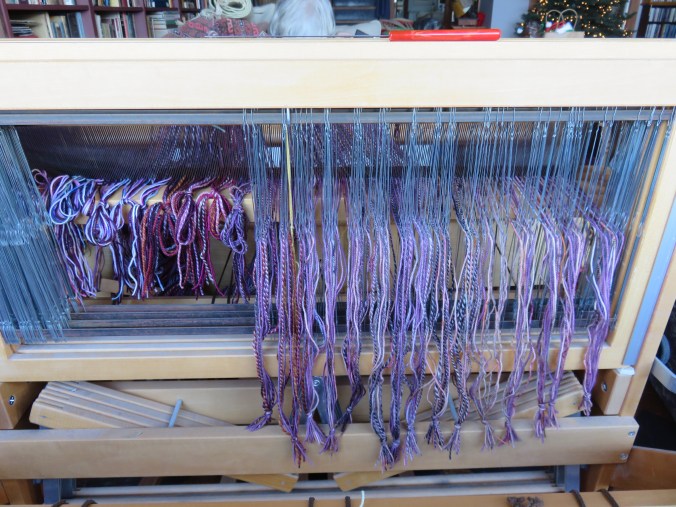
Canadian hand painted and hand spun merino yarn going on the loom.
My favorite pair of gloves are purple. They are not quite dark enough because I want the shade to conceal stains. I want it to work, but I also prefer the shadows. My walls are painted pale tints of plummy gray, but what draws me to purple is the darkness. Purple has a royal association for many people. It is beautiful. It is sometimes called a sophisticated color, but I think of berry stains on my fingers from picking salal. It also reminds me of pain. As one example, I have been thrown from horses, kicked and bitten by them. People do die falling from a horse, but for pure suffering during recovery, I cannot recall anything more painful than that perfect purple-dark bruise risen on my shoulder that took a month to begin fading. That is what I think of first when I think of purple.
Many things that are called purple are not purple at all. Male purple finches have a reddish head. Purple prose is the overblown decorative fluff that gives English teachers an upset stomach. On the other hand, blueberries are more purple than blue. The indigenous blue huckleberries make purple pies. Carrots were originally a purple root—the orange we know today is a sport that became so popular in Europe the original color is an oddity in modern times. Few would consider purple carrots anything but fantasy.
The tall flower spikes of Digitalis purpurea, as its name suggests, is usually light purple. When we were young, my girlfriends and I plucked the hollow flowers from foxglove spires as tall as ourselves. They bloomed on the edge of the woods and we slipped a glove onto each finger. We knew the flowers (and the stems, leaves, and roots) are toxic. Digitalis is the medicine my grandfather took for his heart, and too much can kill, but we ran with our purple-gloved fingers fanned before us in games. I always assumed that the foxglove of childhood games and that I see along my drive to work each June is native. But it is an invasive species, just another European like most of my ancestors. Maybe this is the source of my complicated love affair with purple.
The Purple Heart is a military award for physical injury in the field of battle—implying nothing about the actions of the wounded, other than to honor the wound.
Pretty purple things, amethyst and iolite and tanzanite and the opaque sugilite. The thick petals of orchids can be many colors, but the color “orchid” is violet. I have dyed wool lavender with iris flowers. That iris tint fades in sunlight. It is fragrance as much as hue: violets and lavender, the tuberose, iris, lilac scents. Somehow I associate purple as much with folly as with bloom—the pain bruises.
Yet, as a textile artist, it is the color I reach for, covet, value and strand in weaving. I choose purple to spice yellows or orange in a composition, to spark pinks or green. It is a hue that wants to shove gray around. And that is probably appropriate since purple has a long association with power. The ancient Tyrian purple dye worn by popes and sovereigns for thousands of years was harvested from the mucous of three species of predatory sea snails, known collectively as Murex. The fluid protects the unhatched eggs of the shellfish and drives off predators. It can be harvested by killing the snail, but also through “milking” the mucous gland of the creature. Rare but stubborn, the color, a clear reddish-violet to my modern eye, withstands fading through wear, light, and washing. The dye was already ancient when Aristotle, who was so right about some principles and so very wrong about so many particulars, detailed its production.
In the mid-nineteenth century, a British chemist invented the first aniline dye, originally called Tyrian purple and then marketed as mauve, a delicate, slightly grayed, reddish-purple. It is on the edge of being a cool color, found on the color wheel opposite yellow-greens.
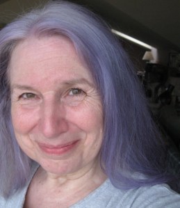
In youth I leaned to warmer colors—orange, vermillion, russet reds, dusty pinks, burgundy, and wine red. My preferences changed over the years and purple moved from a supporting role in accessories to center stage. This shift is reflected not only in what I wear, but in what I want to touch. I wore bellbottoms striped in black, lime, pink, and purple when I was fourteen. I dyed my hair purple when I was sixty, a joke on the old ladies of my childhood who used rinses to counter yellowing that turned their gray hair distinctly violet.
Purple is the foil that makes paler, more timid tints dance. Purple is the look-at-me color, associated with power, with royalty, nobility, Lent, Easter, and Mardi Gras, but very rarely named as favorite. Studies suggest that it is a color preferred by artistic folk, more often women than men, older adults rather than younger ones, and that was the character of the room.
Sandra Cisneros had to fight conservative design review to paint her San Antonio, Texas Victorian home periwinkle blue, a pale blue-violet tint by my estimation, and proved to be historically accurate. There are painted ladies in San Francisco—not women, but the grand tall Victorian mansions of that city—painted in shades of violet. A favorite house in Seattle is a smokey violet shade I found on a paint chip called “Steson” with a bright red door. Hyacinth macaws are purple, and the queen of England is known to wear tints of that particular blue-violet. It is stitched into the border of a a sari or the facing of an Afghan dress.
It makes a pattern in concrete sidewalks. Clear glass pavers were made with manganese to clarify the glass, but eventually the iron that once clouded the glass swaps ions with manganese and over years of exposure to sunlight, the clear glass turns purple. City sidewalks built with glass “prisms” faceted to direct light to anyone working in the spaces beneath. There are such sidewalks across the country in Texas and British Columbia, Seattle and New York City. Many have been damaged over the years, but the surviving glass in sidewalks is generally quite purple.
Violet is on the edge of wavelength in light that humans can see. Shorter X-rays and gamma rays and ultraviolet exist beyond the visible violet, just as microwaves and radio waves lie on the other side of the light spectrum beyond red. The rainbow shows purple inside the sweep to fairy gold. Some gifts seem the work of the supernatural. In The Color Purple, while discussing their view of God, Shug tells Celie she thinks God wants to be loved, “I think it pisses God off when you walk by the color purple in a field and don’t notice it.” We are supposed to appreciate the gift.
We are supposed to appreciate the gift of that richness and precarious pleasure, the flower that blooms for a day, the shellfish that guards its eggs with purple mucous, the semi-precious gemstone, the pebble in the water, and even the fresh bump on an elbow, the toxic flower cups that fit on fingertips, the fine line between the violet we can see and the next shade over that is invisible to our eyes. There is beauty, but concealment too, a warning both ways. My purple gloves are meant only to protect my hands from the cold. In sunny weather I require some other protection. It is ultraviolet that burns our skin.
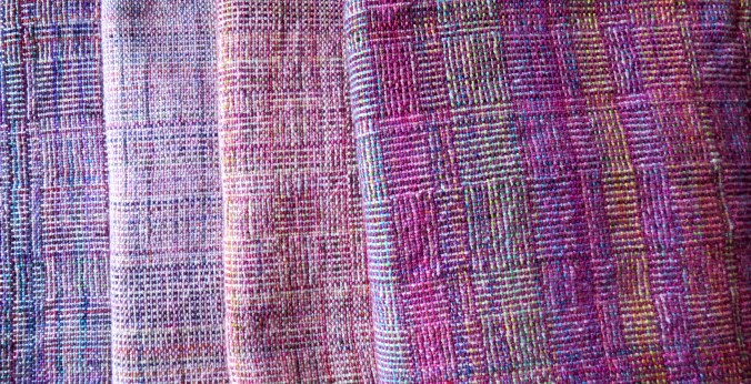
Four scarves woven on the warp shown at the top. The weft is completely different in each.
The online test was supposed to diagnose my ability to see colors. I stared at the screen and searched for the number hidden in a forest of little circles. I passed that one. I am not color blind. Then, a few days ago I took one that was supposed to identify a minority of humans who can see colors that almost no one else can see. Another test offered to determine whether my eyesight is acute enough for a military pilot. I would feel enormous pride if I were found to possess exceptional perception of color. I do not. I am deeply disappointed when I fail such evaluations. In a rainbow, I see colors from the violet through red, and the ordinary hues between that most people see. I easily distinguish between red and green—the most common form of color blindness. I can nearly always detect subtle variation in color. My perception of the color red fades first in waning daylight, just as it does for all humans.

My eyesight is normal, at least insofar as what colors I see. The rods in the back of my eyes which distinguish light and darkness are likely fading as I age so that my vision at dusk is less clear than it was when I was a girl. Most people lose some degree of night vision as they age. It is why my husband Gary still does not like to drive in the dark. It is another reason why the elderly are more at risk to stumble on their way to the bathroom in the middle of the night. And it is also a contributor to older people giving up reading. They cannot see as well without brighter task lighting, but they fail to connect their struggles reading with poor lighting in their homes.
The loss of rods in the retina can be addressed with a lamp. The loss or lack of cones, the light-sensitive cells that read colors, is more problematic. Cones allow people to distinguish between the three colors of light: red, green, and blue. Some color vision, like light vision, is lost with age, and the ability to see color accurately may be lost due to trauma or illnesses such as leukemia or Parkinson’s. Cataracts, for example, impact color perception, turning skies pallid and strange. (The sky turned back to sky blue after Gary’s cataract surgery.) When cataracts are surgically corrected, color vision returns to normal, but most color blind people are born with a lifelong handicap. And for about one in twelve men in the world but only about one in two hundred women, it is genetic.
An adaptation of our diurnal ancestors was color vision. Scientists assume that early lifeforms were nocturnal and completely color blind. As we woke to the day, our senses included color. Birds have a rich range of perceived colors and perhaps that is understandable in species that rely on color to navigate, eat, and find mates. This makes me wonder about owls. As nocturnal birds, do they lack color vision? The cone cells that detect color are blind in low light.
Among people of color, especially from sub-Saharan Africa, color blindness is uncommon, while among white people, especially from Scandinavia, the incidence is higher, especially among men. About nine million British citizens have some degree of color blindness and nearly all of those people are men who inherited the condition from their parents. Men are at a disadvantage because, while blue is inherited on a non-sexual chromosome, the red and green color-perceiving cones are carried only on the X chromosome, and thus men have only one shot at inheriting what they need to see what I can still see quite clearly. Christmas colors.

Ordinary color blindness limits a human’s ability to see one or more of the three colors of light—red, green, and blue. Most people who suffer from color blindness are blind to two of these colors, but only half are moderately or severely color blind. The most extreme color blindness, no color vision at all, is extremely rare. In my county in northwest Oregon of less than forty thousand people, almost two thousand are likely to be color blind. These people are not truly blind to color, instead they have some impairment of their ability to see the full range of colors. With an overwhelmingly white (90%) and significant Scandinavian population, this is not surprising. The defect is most common in people with European ancestry.
About half of these local citizens, shy of 2000 people, color blindness is moderate to severe—they do not see a particular color well or at all. Of the people likely to be colorblind in my county, 250 would have some level of the most common form of red-green color blindness that confuses those colors (deuteranomaly), about 50 would lack some degree of red perception (protanopia), 50 would lack blue (tritanopia), and in our richly wet and verdant landscape, 50 would see green trees as washed out, yellow, or gray (deuteranopia). Perhaps in my state of almost 4 million people, about 180,000 people have some degree of color blindness. More significant. 120 people might have true color blindness (rod monochromacy) and are unable to distinguish any color at all.
Does color blindness make a difference day to day? A fair percentage of people even in first world countries survive youth completely unaware that they see less than their peers. I recall a television show I was invited to participate in as a teenager. One of the other teen panelists announced just before we went on the air that he had enlisted that day and discovered he was color blind. “I didn’t even know,” he said. I asked him the color of the dress I was wearing. He looked it over carefully and replied, “Sort of beige?” All these years later, I can guess he had protanopia, the form of color blindness that limits perception of red and would have made my bright orange-juice-colored dress appear pale muddy yellow.
Most color blindness is a mild inconvenience. Even with his limitation, the new recruit had learned the light at the top of the signal indicated he needed to stop. And then at eighteen he understood he would struggle forever to determine whether a steak was raw or cooked, whether a Marine uniform was merely dirty or smeared in blood.
That boy had gone through most of his teens unaware that the rest of the world saw something different from what he saw.
This is not unusual. Researchers find that many children fail to notice that their vision is hindered, and those children who do are most likely to disguise their handicap. Parents may note their child making unusual, perhaps creative color choices with paint sets, and these children may struggle to identify colors. The child may complain of headaches or smell his food because he cannot tell from color what he is offered on his plate.
The conversation with my colorblind peer must have had an impact on me, because it was about that time that I was first tested for color blindness myself. I had not shown any symptoms of limited perception. I think I asked for the test. The doctor brought out a series of cards with variously sized and colored dots, one similar to the original Ishihara test invented in 1917. Slight color differences revealed numbers on each card. I was shown only a few out of the stack—Do you see a number? I did. This one? Another? Then the doctor declared my vision normal and put the cards back into their folder. I recall being disappointed that I was not allowed to look at all of the cards. Such tests are still used today to identify color perception.

Color blindness can create challenges in reading a map or recognizing whether someone is sunburned in time to warn them; they may not see the difference between a blue-eyed dark blonde and a green-eyed redhead, or be able to use color-coded test strips for water quality. A salad might have the appetizing hue of shredded cardboard. Most people cope, but how would I have placed my crayons in rainbow order without normal color perception? This distresses me. Did I embarrass some grade school boy by pointing out his colors were out of order, when he was himself unable to see that order? Worse, how would a colorblind person distinguish red lights or others warnings if there were not additional cues such as words or location. LEDs might all look the same. A red warning light might look identical to the green one assuring that everything it fine.
Physical capacity to see color is at the basis of much of what I do each day. I am deeply invested in color—the colors I paint my walls, the clothes I choose to wear, the play of hue and value in patterns, the way daylight alters everything. I enjoy subtleties of the jar of hundreds of agates plucked from the shore, the bright Sharpies in an orange tea mug on my desk, the handpainted yarn I weave. I would miss color. My world would be immeasurably impoverished without it.
For my entire childhood, my family’s only television was black and white. I did not miss color then, and indeed films were still made in black and white. We went to a family friend’s house to watch The Wizard of Oz in color, and the instant Dorothy opens the door, I noted the technical flaw. The door itself turns from gray to muddy brown. How old would I have been? Seven, eight? I understood immediately how the trick was done—it is not that everything past the door is in color, but that everything is abruptly filmed in color—maybe that is why there was nothing overwhelmingly magical in my memory of that experience. I went home to watch our black and white set without feeling deprived. Color was everywhere: in the carpet, my mother’s glass mosaics and enamels on copper, and just outside our door, the world was always in color.
But I do not see everything there is to see. What colors I can see comprise only a narrow band in the entire range of the colors that exist. Insects see a far broader range of colors invisible to my eyes, and though dogs are famously colorblind, my dog can see in the dark while I am tripping over furniture.
Still.
What I see is not all that I receive. My connections to colors are more complicated. Pale blue and and green and gray and glowing white are the colors of my sky and the sea outside my window, a soothing mix of gentle hues sometimes at war with the weather, with wind and lightning and raging surf. Green is the color of trees and growing things, and I see it wherever I look, because this is the coast of Oregon. The sun might be yellow, but I do not see it up in my sky today. Sunsets are most often glistering orange, while a sunrise wraps pink a full circle around my horizon. Violet is fading bruises and the yarn under my hands.
What I see is what is there to my human eyes, and also everything else I have ever seen that shares the scent, shape, texture, and color of that surface.
Red is the color of blood and lipstick and Oklahoma roses. My own blood dripping down from my knee to white ankle socks, my grandmother’s thick red lipstick, the roses Papa planted along the driveway. When I see a octagon sign, I don’t need red or even to see the letters to know I must stop. Green is home, the long-sleeved dress I loved as a child, trees, and tight furls of opening pine needles. My vision is not special, not rare or strange. A tiny percentage or perhaps even most other women may have, along with their double dose of X chromosomes, the extra ability to perceive colors no man can.
Recent studies find some women expand the seven hues most people identify in a rainbow to include dozens more. These colors are mostly a conflagration of greens—green is go—and that would be something to see.
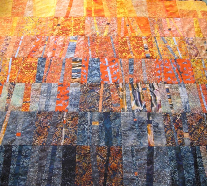
My friend is mourning a cedar tree she passes each day on her way to work. The droopy foliage has abruptly turned orange, an indication the tree has died, perhaps of infection with cedar apple rust or another disease or just due to a peculiarly hot and dry summer. I don’t know the tree she is describing. It is likely the native western red cedar, Thuja plicata, and named for the color of the lumber harvested from the tree, or it could be an introduced cultivar such as arborvitae. What is not in doubt is that the tree has died and it is bright orange. Orange is not a color most people would associate with death. It is a juicy hue.
Orange as a color name entered English in the sixteenth century but the color had always existed, of course, and had previously been called “yellow-red,” ġeolurēad in Old English. The word itself traces its lineage from fourteenth century English, back to Old French or perhaps Spanish through the Arabic nāranj, the Persian nārang, and eventually to the Sanskrit nāranga, meaning orange tree, a word that might derive from an even earlier word meaning fragrant. Our word for the color orange and the fruit have an ancient co-existence, but the citrus fruit came first.
There are synthetic citrus flavors and scents. In fact, lemon and lime and orange are among the easiest flavors and scents to synthesize. What is complicated and thus wonderful about the real orange is the cut wedge of fruit, pockets of juice sliced through and dripping, teeth biting into those tapered slices of juice, the flavor running across the tongue, down the throat and chin. The sticky, flavorful residue, then taking a strip of orange peel and folding it inside out to rupture the cells in the peel, and the mist of orange oil visible in the air. No chemical creation matches that experience, and no synthetic scent lasts as long as the real thing.
The citrus family includes limes, lemons, mandarins, pomelos, grapefruit, as well as oranges. The actual colors or peel and pulp range from the green of limes to the ruddy maroon of blood oranges. I am a fan of all these fruits. In Paolo Bacigalupi’s much-lauded bio-punk science fiction novel, The Windup Girl, the entire family of citrus fruit trees have been killed off by a virus and the younger generation has no idea what they are missing. This was one of the most striking images I found early in the novel. Imagine all the citrus in the world gone, never to return! How would I explain to my grandchildren the taste of an orange, what one was like? Describe eating the pulp out of a quartered orange and how I placed the emptied peel in my mouth to make an orange smile when I was nine. Imagine generations of children never able to do that in real life.
I could not explain that.
The orange fruit is a symbol of the Pre-Raphaelite movement and of weddings in many cultures.. The House of Orange, Huis van Oranje-Nassau of Netherlands was founded in the sixteenth century by William the Silent or William of Orange. But the color does not appear on the royal coats of arms, which shows blue, red and yellow. None of those old royal coats of arms include orange, though many use its components, red and yellow—no mixing of those primaries allowed. Orange is a secondary color on the painter’s palette, primary only in flames.
Orange is the color of settled-down-for-the-evening driftwood fires and of sunsets over the sea. Unlike sunrises which most often tint clouds pink, the sunsets in my sky are livid orange, glowing coals settled along the horizon. “Red” hair is orange. Orange is the color of many flowers such as the the six-petaled Montbretia and the darker orange crocosmia, a variety named “Lucifer,” that naturalize locally, and the many-petaled daisy-like British Calendula, used since the middle ages to control fever and heal wounds. There is the dust of burned ferrous oxide, oxidized iron, what we call rust, FeO. Gone with the Wind’s “red earth of Tara” is not red, but ruddy orange from iron oxide in the soil. The first time I visited Georgia, I was thrilled to see this orange-blushed soil.
An article in Forbes cites research suggesting that warm colors such as orange can create an illusion of physical warmth, and that orange in particular is associated with good value—not moral values, but monetary ones. Maybe that’s why so many sale stickers are orange. It is also likely that orange is one of the more striking colors, a noticeable color, unlike green or blue or neutrals that might fade into the background. Orange is the color of warning signs and labels. A color we might find untrustworthy. Orange is often called bright. Add white to it and orange becomes a tender different fruit: peach or apricot. Orange darkened with black morphs into a shade we label brown, but few people associate pale peach and brown with orange in the same way they recognize sky and navy as a tint and shade of the same blue.
A little smoke and some white turns orange into a discontinued Pratt and Larson paint color called Caravan. We painted a bedroom in Seattle that color and then our bedroom in Oregon the same hue. This pastel owed nothing to baby shades, more to stucco walls, tropical fruit, pale carnelian, the bottoms of baby feet. A paler tint of flicker’s flight feathers, life rafts, sweet and sour sauce, colors screaming for attention. Caravan lifts the eye without compelling attention.
I feel juice sliding down my chin from a slice of peach pie—I think more often of food than of warning when I think of orange.
A name for the color orange does not even exist in many languages. All languages identify the sky as blue, blood as read, but like the red-yellow of Old English, orange is the least likely hie to have its own label in hundreds of languages around the world. But oranges! Those luscious fruits dripping across my tongue—the flavor and scent is unmistakable. The tongue and eye know orange even without words. Orange as a name comes from flavor.
The cliché of orange is Halloween pumpkins and autumn leaves. But pumpkins, born in Mexico not in New England, come in many shades. And the maple trees we watch for on our morning drive turn pale yellow in the fall or maroon if the nights are cold. The colors we might expect are oranges I find in agates and scallop shells, daylight in the late afternoon shining through ears, the wooden beads on my son’s camp necklace, the teacup filled with markers, my favorite handknit sweater. the spines of Penguin Books, cantaloupe flesh and copper wire, a spool of thread, chrysanthemums and bittersweet and witch hazel blossoms, the inner bark of alder trees cleaved by an ax, Chantrelle mushrooms I find in the duff of spruce glades and the bright shade of salmon eggs further upstream, ground chili and turmeric, carrots and caution signs, traffic cones, a dying leaf. The death of a cedar tree. The famous cedar tree, “Quinault Lake Redcedar” that lived due north of us, was killed recently in a series of winter storms. Less than two hundred feet tall, the was impressive for its nineteen foot girth rather than more unexceptional height. Maybe it turned orange as it died, but I did not witness that warning.
Orange may be a sign of trouble, but I prefer its more common role: the sweet, sharp, sticky, sour, succulent, salty sweetness of day’s end cry of joy.
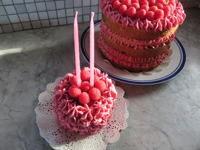
[CLICK TITLE TO READ MORE] I made my youngest grandchild a birthday cake for her party today. She is two years old. I also made a 2-year-old quilt, something I also did for each of her cousins. Pink is her favorite color. For now.
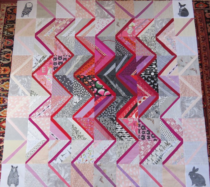
EV’s quilt, completely pieced but before it was quilted.
The quilt is cotton with a cotton filling and a pieced backing that is partially pink with metallic gold dots. The cake is yellow, some of it tinted pink from the addition of black Oregon huckleberries. I made lemon curd and raspberry jam for the fillings, and a huge batch of blackberry buttercream for the frosting. It is the most incredible pink. I knew this trick with blackberry juice in buttercream from a previous series of cake made to please my oldest grandchild, who turned six last fall. Fresh organic raspberries. Organic everything, because we do not like to take chances with toxins.
Two cake batches, blackberry syrup to flavor and color the double batch of buttercream, and lemon curd. I completely thrashed the kitchen. Powdered sugar everywhere. Crumbs. Gary was cleaning my mess for me as I began typing this.
Gary is good to do this cleaning, but he reminds me that I was in the kitchen all day. He had a hard day himself. We had to make a correction to our taxes, he cleaned the walkway and trimmed shrubs on the north side of the house, and his brother called to complain and then hung up on him. This brother is afraid of all sorts of things that might not worry me in the slightest. That’s because he is mentally ill and unable to step away from himself long enough to think about others. Others are always dangerous to his mind.
Years ago I heard the poet Naomi Shihab Nye say that even as a child she felt this strange homesickness for a place she’d never been. She realized that what she missed was the place where poetry resides. At least, that is what I remember her saying.
Another poet, the marvelous Tracy Smith, recently discussed the terrible hunger she sees for literature: “I have this belief that we are so vulnerable when we open ourselves up to literature. We’re reminded of these real parts of ourselves.” Perhaps it is that willingness to be vulnerable, that we pursue. It is some vestige of glory in our souls—not paychecks or adoring crowds or battlefields, but something more like what e’re inclined to term humanity.
Some see vulnerability as weakness, when it is actually strength. To be open and accepting requires that we have the strength to remain standing under the weight of chance, of betrayal and error. Not everyone can manage that.
The alternative is continual anger and fear. No one is wise while continually angry and fearful.
Ursula K. Le Guin writes: “All old people are nostalgic for certain things they knew that are gone, but I live in the past very little. So why am I feeling like an exile?” No time to lose—yes, that’s it exactly.
I willingly call myself old and I am grateful to Le Guin for reinforcing my sense that aging is inevitable, but has its perks. I will die, but I have lived long enough to know what might be missed if I fail to pay attention.
The past is not my usual space to dwell, though I fret over lost friends and family. I fret over misunderstandings concerning recent history and that my students do not know the parts of speech or how to construct a formal outline. I am nostalgic for my own excellent education. More often, I look ahead to what I might still accomplish. Most often I am here and now, figuring out my life one step forward at a time.
I have thought about my place in time often over the years. Just now, reading Le Guin’s last book, I am thinking a good deal about what I might do with whatever time I have left. I might have as many years as Ursula. She was younger than I am now when I first met her, and her lifespan suggests I might still be living and writing sensibly into my 80s. I hope during this time to find the poetry in myself.
More of us might seek that strength that risks communion, that loves and forgives, that locates the heart of our hearts. I think, at least, that I might have time to do that, to continue looking forward. To open myself. To hear. And to give voice without fear.
And pink cakes.
 IMPERFECT PATIENCE